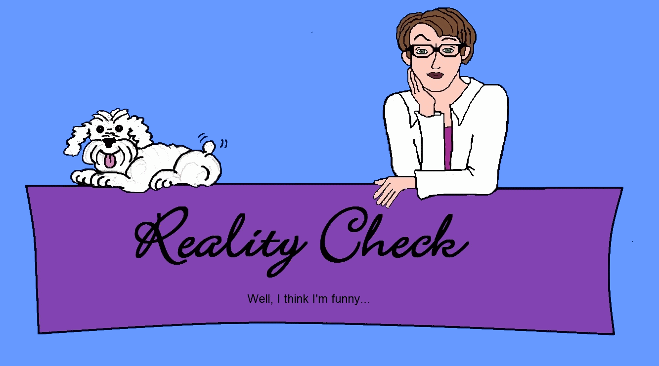
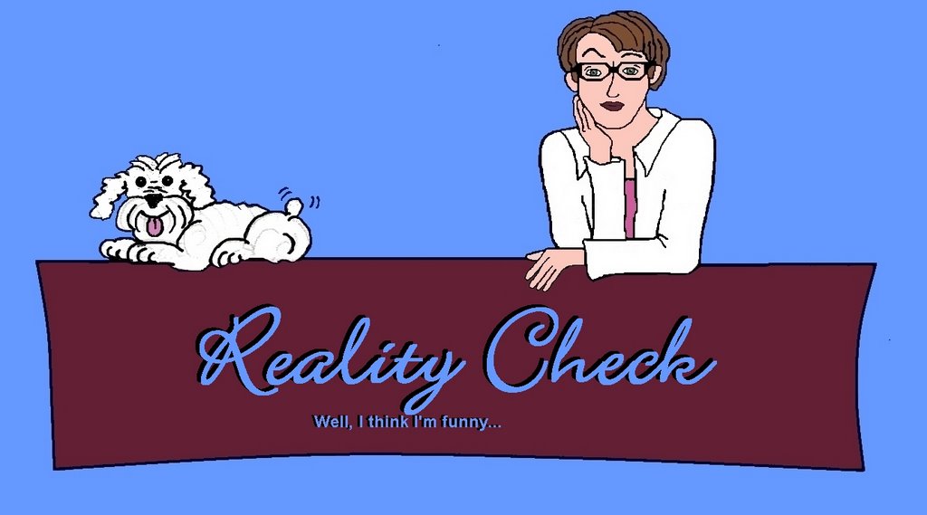
I can't decide which I like best or if I even like the graphics. Jess is going to be sick to death of seeing this as I have been working on it for weeks. But, I'm ever a perfectionist, so shut up.
Which do you guys like best? Do you think I should try and make it look less... angle-ish?? I'm not sure. Sometimes I like it and other times, not so much.
I like the purply/maroon colour best. And I like the font lots.
ReplyDeleteShannon! One is purple. The other is maroon. Now I'm so confused!!
ReplyDeletei like the second one...just make the 'reality check' the same size as the first.
ReplyDeleteI think the colours of the first one are more complimentary, but I'm a boy and the wife won't let me leave the house without consulting her on clothing so I'm probabbly wrong.
ReplyDeleteYou know, Jason, I think your wife is smart, she seems to have taught you well. I think I like the colours of the top one best too. Hmmm. It is a quandry. Well, I have all day tomorrow to work on it!
ReplyDeleteIf only I could figure out how to put it up there.
I think the burgundy one is pretty. And I like the fun font.
ReplyDeleteI like the purple. On the other hand, you look like a guy version of Annie Lennox, as opposed to reality, which is Angelina-in-hackers. There are no girls in this drawing! No tatt, either. Show me the paw!
ReplyDeleteSorry, on my laptop the top one looked blue. Now that I'm on my work computer I like the top purple one best becasue you can see the words easier.
ReplyDeleteMaddie really is adorable.
I like the top one better too because it stands out better. Let it be said now, though, that you are better looking than the cartoon depiction!!
ReplyDeleteThank you all. I think I'm prettier than the cartoon version too, but I suck at drawing, so it was the closest I could get. I'm just thrilled with the fact I look like a person. And Maddy is my favourite. Isn't she adorable like that?? Maybe I should just take me out of the picture altogether and leave just the dog. No tattoos on this version or the next - I'm going for cute, not trailer park.
ReplyDeleteTop one. The bottom one should have a lighter colored font, eh?
ReplyDeleteRoger: That's what is wrong with it!!! Thanks. I will fix it and see if that makes a difference.
ReplyDeleteFor everyone else: I am working on a better version of the face, etc. Maybe I will figure it out.